
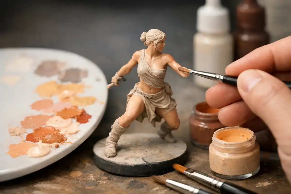
A well-painted face can make a 1/35 infantryman, 54mm historical figure or gaming miniature feel immediately alive. In this figure flesh tones tutorial, the aim is not to find one magic paint colour, but to control contrast, temperature and placement so skin reads naturally at the scale you are working in.
Flesh is often the part of a figure that receives the most attention, yet it is easy to overwork. Heavy outlines, bright white highlights and strong pink washes can look effective under a magnifier but harsh on the shelf. A controlled sequence of primer, mid-tone, shadow and selective highlight is more reliable, whether you prefer acrylics from Vallejo, AK Interactive and Ammo by Mig or traditional enamel and oil techniques.
Figure flesh tones tutorial: start with scale and light
Before choosing colours, consider the figure’s size and intended viewing distance. A 28mm wargaming face needs clearer value changes than a 1/16 bust because the details are smaller and the light has less physical surface to describe. At 1/72 scale, suggestion matters more than finely painted anatomy. A warm base tone, a darker recess under the helmet brim and a tiny raised highlight across the nose may be all that is needed.
Light direction should also be decided before the brush touches the figure. Most modellers use overhead lighting, which places the forehead, nose bridge, cheekbones and upper lip in the light. The eye sockets, sides of the nose, lower cheeks, area beneath the chin and neck fall into shadow. Keeping this direction consistent matters more than copying every crease sculpted into the face.
Primer helps enormously here. A pale grey or off-white primer gives clean, readable flesh colours, while black primer provides strong definition but can make thin acrylic layers appear dull. Zenithal priming is useful for larger-scale figures, although it should guide your painting rather than replace proper shadow and highlight work.
Build a flexible flesh-tone palette
You do not need a separate set of paints for every figure, but a small, adaptable palette makes matching a subject much easier. Begin with a mid-tone that suits the individual and setting, then adjust it rather than reaching automatically for a generic peach colour. Real skin contains red, yellow, brown, grey and sometimes blue notes depending on lighting, complexion, temperature and exertion.
For a fair or lightly tanned complexion, a beige or flesh base mixed with a little red-brown is a dependable starting point. A deeper complexion can begin with a warm medium brown, then use reddish browns, yellow ochres and muted dark browns to vary the shadows and light. Avoid treating darker skin simply as a pale-skin recipe with extra black added. Black can flatten colour quickly, whereas a mixture of brown, red, purple or deep blue-grey retains life.
A practical five-paint working set consists of a flesh or beige mid-tone, red-brown, yellow ochre, dark brown and an ivory or pale warm highlight. A muted purple, burgundy or blue-grey is also useful for the coolest shadows. White should be used sparingly. It is better to lift highlights gradually with ivory, pale flesh or a small amount of yellow-beige than to jump straight to pure white.
Dedicated ranges can make assembling a coordinated palette more straightforward. Explore AK 3rd Generation figure paints and Ammo Mig figure paints for colours suited to figure and miniature painting.
For military subjects, remember the environment. A tanker in a dusty vehicle, an Arctic infantryman and a desert patrol figure should not share exactly the same finish. Sun, cold, dust, fatigue and reflected light all influence the appearance of exposed skin. These effects need restraint, but they help the figure belong to its base and vehicle rather than look separately painted.
Thin paint, not watery paint
Acrylic paint should be thinned enough to flow from the brush without leaving a grainy edge, but not so much that it pools in every sculpted recess. Aim for several translucent coats. Two or three thin coats of the base colour give a smoother result than one thick application, particularly on faces with shallow detail.
Use a wet palette if you have one, especially when mixing successive highlight colours. It slows drying and makes it easier to return to the same mixture. For small faces, a quality pointed brush with a good belly is more valuable than an extremely tiny brush. A size 1 or 0 often carries paint more predictably than a worn size 000.
Paint the face from mid-tone to shadow
Apply the mid-tone across the whole face and let it cure fully. Then mix a shadow colour by adding red-brown and a touch of dark brown or muted purple. This should be noticeably darker than the base, but not an almost-black line.
Place the shadow deliberately in the eye sockets, beneath the nose, below the cheekbones, around the ears, under the lower lip and beneath the chin. On a helmeted figure, deepen the area under the headgear. On a bare-headed figure, a little warmth around the temples and hairline can improve the transition to the scalp.
At this stage, the face may look stark. Reapply the original mid-tone to the centre of the cheeks, lower forehead and chin, carefully feathering it towards the shadow. This is the first step that turns separate paint bands into a face.
If you use washes, keep them controlled. A very thin red-brown glaze can reinforce depth, but an all-over wash frequently makes skin look grubby and can leave tide marks on raised areas. It works best over a textured gaming miniature or as a first pass on a small-scale figure. On a display figure, targeted glazing generally gives cleaner control.
Add highlights where they count
Mix a highlight from the base colour with ivory or a pale, warm flesh tone. Paint it onto the upper forehead, nose bridge, tops of the cheekbones, chin and upper planes of the lower lip. On larger scales, build two or three highlight stages, each covering a smaller area than the previous one.
The brightest highlight should be tiny. A pinpoint on the tip of the nose or highest cheekbone can be effective on a 1/16 face, but it is usually too much for 1/35. At smaller scales, keep the final highlight soft and broad enough to read from a normal viewing distance.
Do not forget the neck, hands and ears. These areas should relate to the face, although they do not need identical contrast. Ears often benefit from a thin, warm red glaze, while knuckles and fingertips can take a restrained lighter tone. For a figure in cold conditions, a muted blue-grey shadow mixed into the jawline, nose and fingers suggests chill without turning the subject theatrical.
Eyes, mouths and five o’clock shadow
Eyes are a common source of exaggerated figures. At 1/35 scale and below, paint the eye socket as shadow and leave it there unless the sculpt is unusually large and clear. A visible white horizontal stripe makes most figures look startled. For 54mm and larger figures, place an off-white eye shape first, then add a small dark iris. Keep both smaller than instinct suggests.
Paint the mouth as a soft shadow or thin red-brown line, not bright red lips. A subtle glaze around the lower cheeks, nose and lower lip gives healthy warmth. For stubble, glaze a heavily thinned blue-grey, grey-brown or desaturated green-grey over the jaw and upper lip. Build it gently. Stubble should change the skin tone rather than sit on top as a solid beard.
Correct flesh-tone problems with glazes
Glazes are one of the best correction tools once the main values are in place. If highlights are too pale, glaze the mid-tone back over them. If the face feels cold and lifeless, a highly diluted red-brown or warm flesh glaze around the cheeks can restore warmth. If shadows look too red, soften them with a thin neutral brown or purple-grey glaze.
Let each layer dry before judging it. Acrylics often look darker when wet, while oils take longer to settle and blend. Work under a neutral daylight lamp where possible, then stand back from the bench regularly. The right finish is the one that looks convincing at display distance, not necessarily the one with the most visible brushwork under magnification.
A satin or matt varnish can unify the finish. Dead-matt skin may look chalky, while a glossy face can appear sweaty unless that effect is intentional. A restrained satin finish often suits larger figures, with matt varnish remaining a sound choice for smaller military and gaming subjects.
Keep a note of successful mixes for future projects, particularly when painting a squad or set of crew figures. Consistency across faces brings a collection together, while small changes in warmth, shade and weathering ensure every figure still looks individual.
Natural-looking flesh comes from controlled placement rather than excessive detail. Establish a clear mid-tone, place shadows according to the light, add highlights only to raised areas and use glazes to bring the layers together. With a flexible palette and repeatable sequence, you can carry the same technique from small gaming miniatures to large display figures.
